Case Study 1
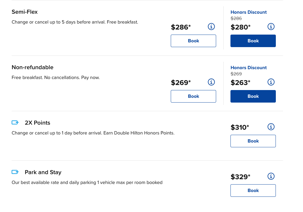
Hilton wanted to increase the number of inventory items they could sell to guests on their digital platforms, mainly their website. To increase inventory, Hilton would create a catalogue of add-ons that guests could purchase alongside their room booking, for example: dinner or parking. The challenge for our product team was adding this new feature to the userflow without increasing the conversion time. Ultimately, we were giving users more options to choose from thereby potentially slowing their decision-making process and increasing cognitive load.
Test
To help inform design approaches and testing, I began the research process with a competitive analysis of some of our larger competitors’ websites. This allowed designers to begin developing prototypes.
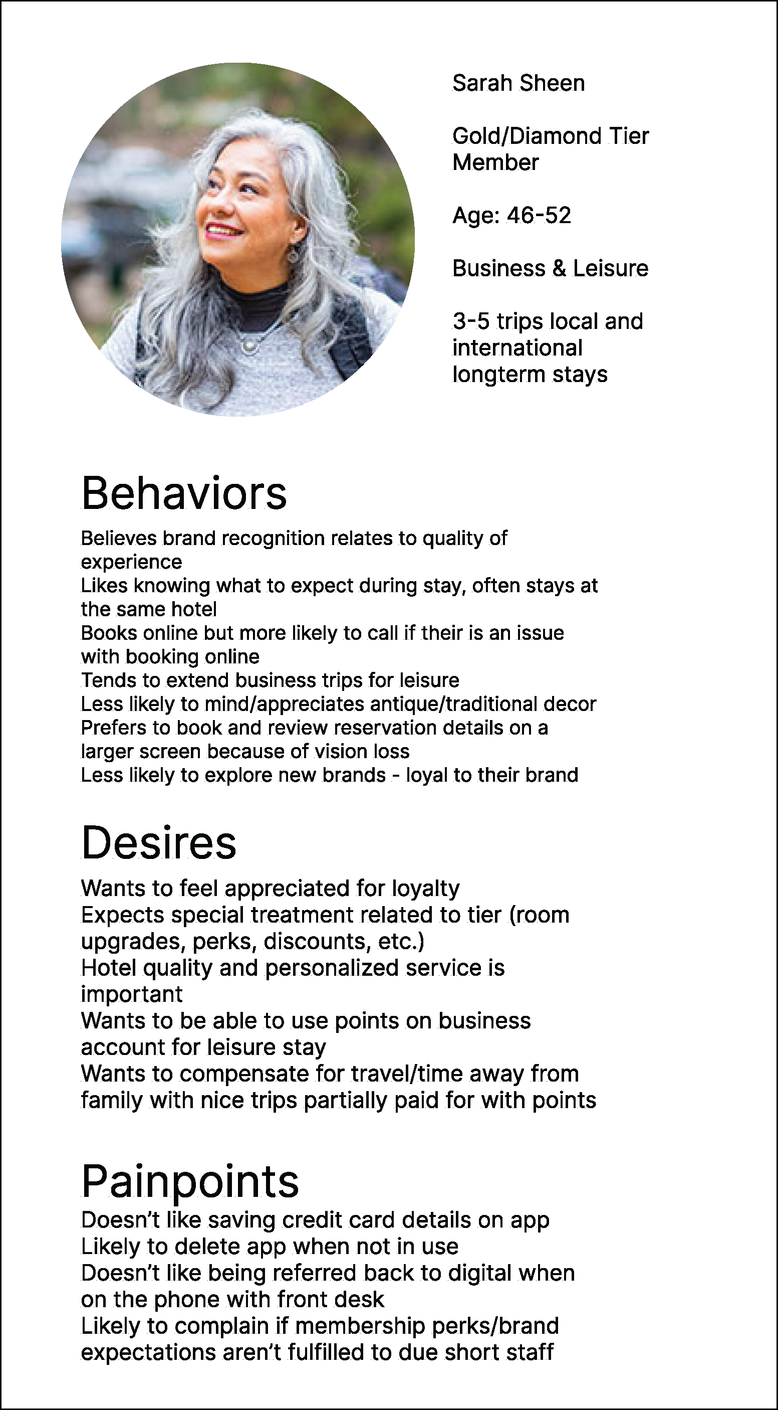
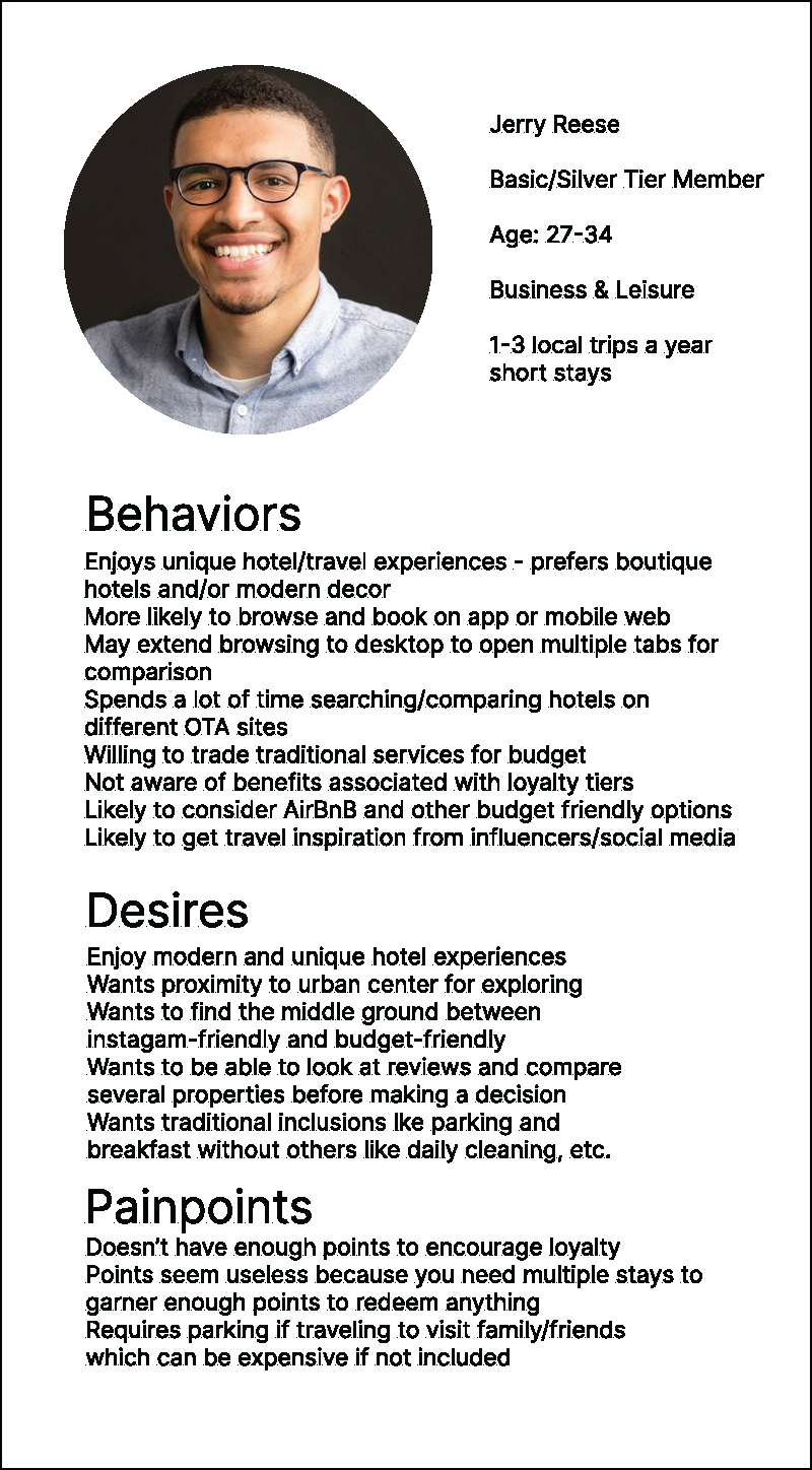
During the project's conception phase, discovery research allowed me to develop personas and understand our user base so that, later on, screeners would be more effective at targeting the various intersections of our users. At Hilton, we had many customer, and therefore user, segments e.g. Gold, Silver, Diamond, with kids, solo, luxury, long, short, occasion.
I designed a usability A/B test comparing two designs. The first design, design A, had a userflow that contained two pages, one which displayed a selection of add-ons and another that contained a selection of room types and room packages. The second design, Design B, combined those pages into one.
Our hypothesis was that design A may decrease cognitive load by breaking up decision points across two pages, while design B may present users with too many decisions on one page, increasing cognitive load and conversion time.
Outcomes
The test yielded surprising results and a few challenges: users did not like having to go through several pages before seeing their total price. They preferred to see the total price of their selections calculated in real time as they made their selections, somewhat similar to the Domino’s Customized Pizza widget. Users wanted to be able to mix and match selections of room types and add ons without having to go back and forth between pages so that they could easily compare the total price before continuing to checkout. Both designs showed potential for increasing cognitive load as both presented more selections to users. However, Design A seemed more likely to increase load and conversion time. Switching between one page to select their room type and rate and another to select add ons proved cumbersome and time-consuming for users.
Ultimately while I steered the team toward a consolidated page, similar to Design B, I urged periodic testing, realizing that when business operations eventually scaled the add-ons program, we would need data about the effect of the increase of purchasing options on users’ cognitive load.


